

Shopify Polaris Design System
I led Shopify's Polaris Design System for 5 years, growing adoption to 89%, orchestrating two major design language transformations and enabling design excellence at scale.
Category
Enterprise
Multi-platform
Role
Design Director
Over my five years leading Shopify’s Polaris Design System, I transformed it from a consistency tool into a strategic platform for design excellence at scale.
We increased adoption from 40% → 89%, re-architected the system for rapid iteration, and shipped a major design-language evolution across ~89% of the admin in just 10 weeks—a process that once took months.
Impact at a glance
122% increase in adoption (40% → 89%)
50+ product teams aligned across one admin
~89% of the admin updated automatically
Sweeping design-language launch in 10 weeks
System now powers thousands of designers and developers
The Challenge: From Consistency to True Leverage
When I took over Polaris, it had achieved surface-level consistency but lacked leverage—the ability to make broad, high-quality improvements quickly.
Fragmented adoption meant that teams were forking components, customizing heavily, and making change slow, costly, and unpredictable. The admin UI, rooted in 2010s flat design, no longer reflected Shopify’s evolving brand or merchants’ expectations of a pro-grade tool.
My mission was simple but ambitious:
“Enable design excellence at scale by creating leverage.”
Leverage meant faster improvement cycles, predictable rollout of visual updates, and a system that stayed modern without massive re-platforms.
Approach: Building Leverage Through Architecture, Data, and Enablement
1. Data-Driven Insight
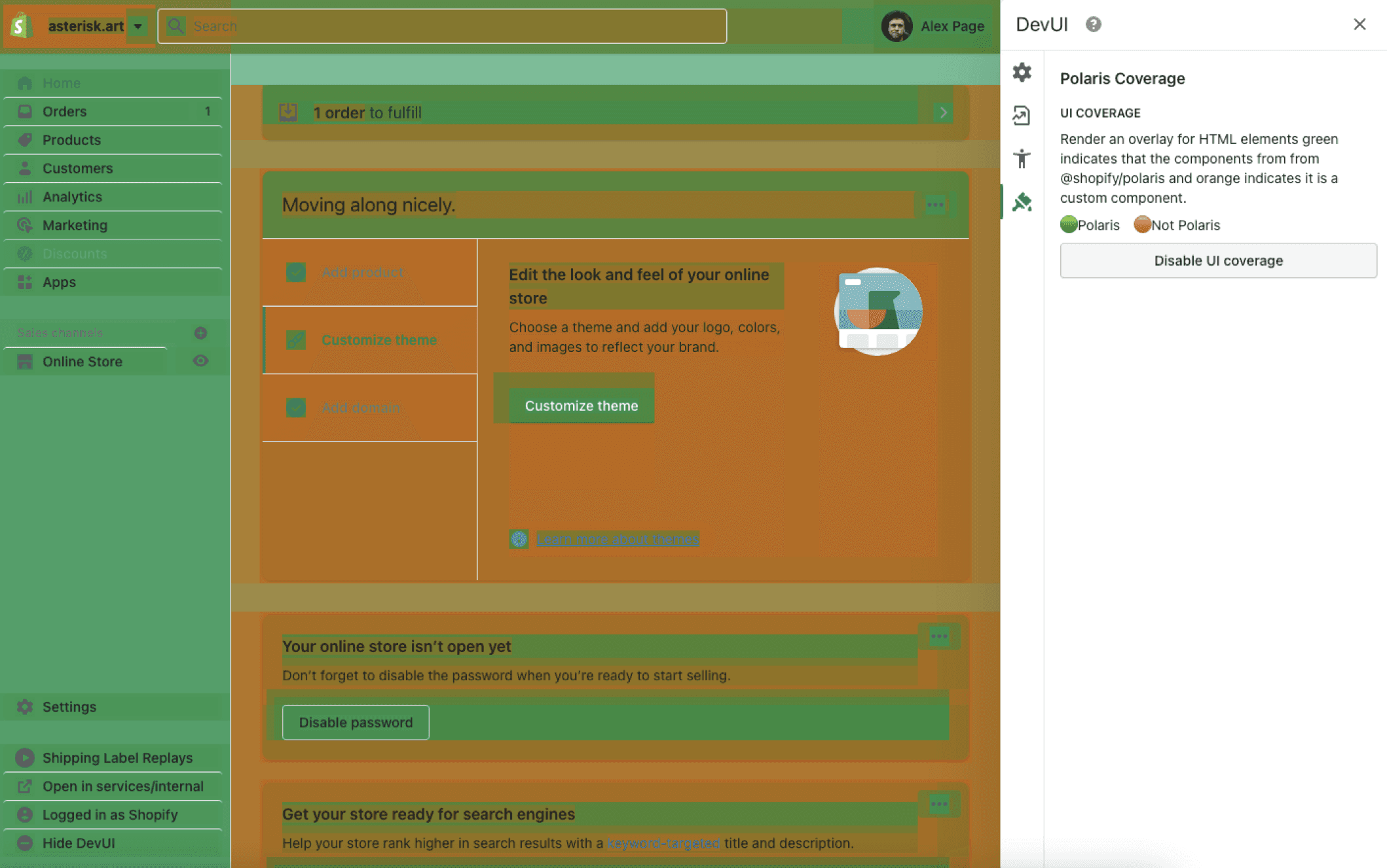
We couldn’t improve what we couldn’t measure.
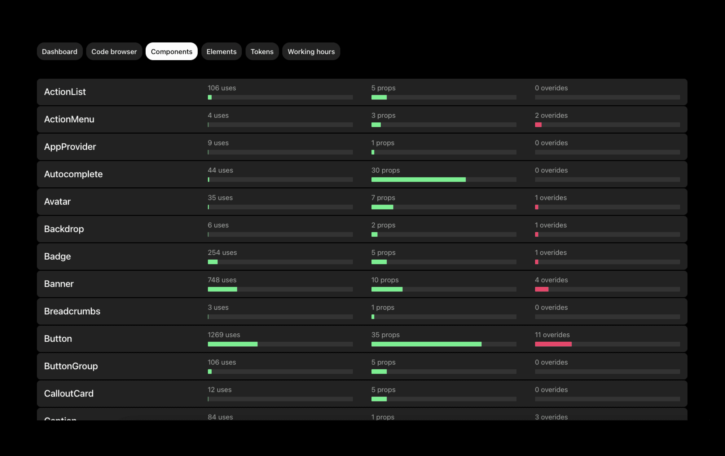
I led the creation of usage heatmaps and coverage dashboards that visualized where teams had deviated from Polaris. This data surfaced core architectural flaws—too many “catch-all” components, missing layout primitives, and over-configuration that forced teams to fork.
2. Architectural Overhaul
We rebuilt Polaris to prioritize composition over configuration:
Introduced layout primitives and spikier components designed for clarity and focus
Replaced SCSS with CSS variables and expanded design tokens as the visual foundation
Reduced bundle size and enabled composability, paving the way for future visual evolution
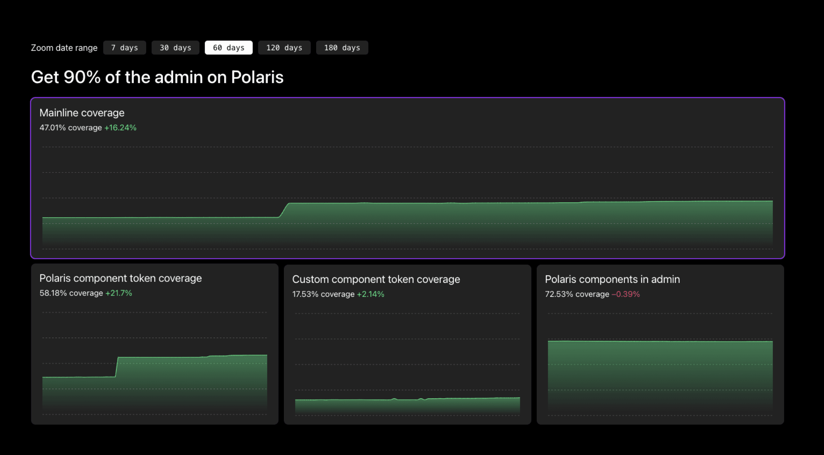
This work brought us to 86.6% mainline coverage, a critical tipping point for leverage.
3. Tooling and Governance
To sustain quality at scale, we introduced:
Linting tools that prevented system violations in code reviews
Migration dashboards for visibility and accountability
Token APIs and improved documentation to accelerate correct usage
A governance model balancing autonomy with coherence across 100+ teams
4. Enablement and Culture
We evolved from passive documentation to active enablement—training sessions, internal advocates, and clear contribution pathways. The design system became a shared investment, not a policing mechanism.
5. Expanding the Polaris Documentation Site
We evolved the Polaris documentation site into a comprehensive hub that supported both principles and practice.
Beyond component documentation, it included design patterns with preferred solutions to common merchant goals, content guidelines that unify tone and clarity, and token documentation connecting visual expression to technical implementation.
At its foundation, Shopify’s design principles served as guiding notions for the admin’s design direction, with Polaris providing the structure and resources to implement those principles consistently and effectively.
The Design-Language Evolution: “A Pro Tool with Soul”
Once the infrastructure was stable, we tackled the admin’s aesthetic transformation—the first in seven years.
Our vision:
“A pro tool with soul — tactile, confident, and distinctly Shopify.”
Grounded in merchant research, I set the strategic direction and creative parameters that guided designers José Torre and Thomas Jonkajtys through exploration. The resulting design language was professional yet human:
Tactile controls and redesigned icons with subtle personality
Inter typeface for clarity at small sizes
Motion curves adding liveliness without distraction
Neutral palette replacing Shopify green with black for versatility

I orchestrated the company-wide rollout—aligning 100+ teams, tailoring stakeholder presentations, and securing executive buy-in through live prototypes.
Because of our new infrastructure, the updated Polaris propagated to ~89% of the admin automatically, transforming the visual experience in just 10 weeks.
Results
Adoption: 40% → 89% coverage
Rollout speed: Major redesign deployed in 10 weeks
Merchant feedback: “Refined,” “useful,” and “professional”
Cultural impact: System reframed as a creative enabler, not a constraint
Reflection
The biggest transformation wasn’t visual: it was architectural and cultural.
By focusing on leverage, we turned a static system into a living platform capable of evolving alongside Shopify’s products, teams, and merchants.

