
Nov 5, 2025
Beyond the Plateau of Sameness
Is your design system holding you back? I hear this question often. Many designers point out, fairly, that design systems can make products feel generic.
I’ve seen this firsthand. At Vox Media, I led the migration of over 250 websites to a unified design system. We achieved impressive visual range across brands. At Shopify, the Polaris design system reached 89% adoption and let us launch a major redesign in just 10 weeks. By the usual measures, these were big wins. But there were tradeoffs. Vox Media sites lost some of their unique character, one editor called it “losing their id.” At Shopify, teams building new features often felt constrained by the system’s limitations, some even calling it a “burden.”
The sameness problem is real. Yet, the reasons most people cite, like “UI bureaucracy” or “design systems limiting creativity,” don’t capture the core problem.
The real problem is in the system’s architecture. As teams try to ship faster and work more efficiently, design systems can lose focus. Components turn into one-size-fits-all solutions that work everywhere but excel nowhere. Designers start from what’s available rather than user intent, leading to a plateau of sameness where everything works, but nothing is memorable.
This article shows how to move from uniformity to differentiation. We’ll identify three key components: Accelerators (invisible infrastructure), Differentiators (where design creates distinction), and Diluters (elements that erase uniqueness). The plateau starts with design system architecture, and breaking free from it does too.
How did we end up at a Plateau of Sameness?
A common critique of design systems is that they “limit designer creativity,” as if the problem were simply artistic expression stifled by constraints. Designers losing autonomy is a symptom, but the real issue isn’t creative constraint. It’s the destruction of conceptual integrity.
Products with conceptual integrity hit three tiers:
Tier 1: Data Fidelity
The interface truthfully reflects the underlying data model, surfacing the attributes users need to recognize, distinguish, and choose between.
Principle: The UI is a faithful mirror of the data’s essential characteristics.
Example: A complex, domain-specific component displaying rich data—like a collection with a hero image, multiple lines of text, and rule badges—should clearly signal its underlying complexity. It shouldn’t be diluted into a generic-looking item just because it shares the same base component as one displaying a simple string label.
Tier 2: Aesthetic Integrity
The UI expresses what users intend to do, not just what data they can enter, and adapts to the capabilities of the input method.
Principle: Form serves function. The shape of the interface matches the nature of the task and the strengths of how users interact.
Example: Consider a discount rule builder. It should feel powerful, providing immediate visual feedback and structured controls that match the logic it represents—not like filling out a simple, sequential form. Conversely, the act of configuring settings should be predictably boring and easy, often using standard system controls, because the user’s intent there is to manage, not to create or be inspired.
Tier 3: Selective Excellence
The product invests design effort where it matters most: in brand-defining, domain-specific moments that set it apart. Instead of uniform polish everywhere, it has contrast between calm baselines and expressive highlights.
Principle: Create memorable peaks rather than uniform plateaus.
Example: A core bookmarking experience for a content app should feel inspiring and effortless, guiding the user to save and organize their content intuitively. That moment is a peak of selective excellence, designed to define the product’s identity, contrasting with the calm, simple baseline of, say, a generic user profile page.
These tiers build on each other. Data fidelity is the foundation. Aesthetic integrity shapes the structure. Selective excellence creates the highlights. Conceptual integrity is not about making everything the same, but about using differences intentionally.
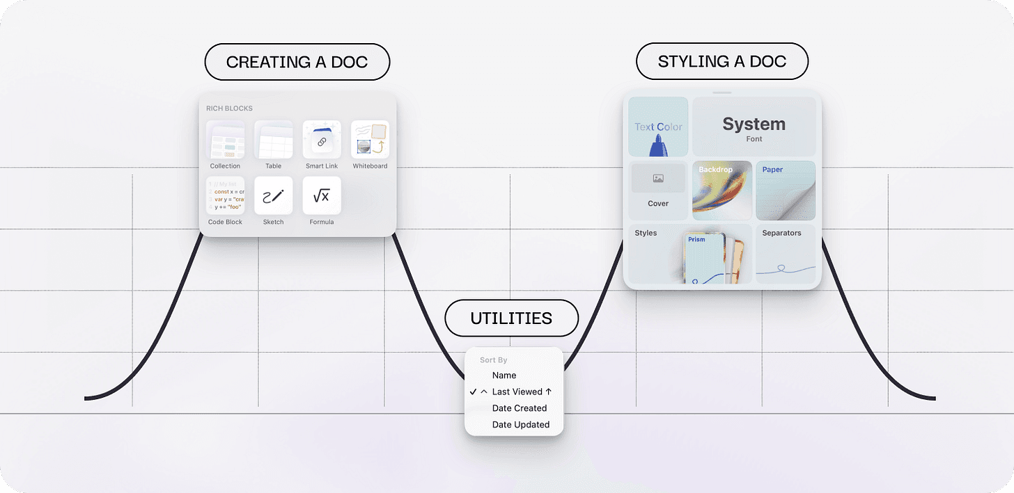
Craft is a beautifully designed, document-centric productivity platform that combines notes, tasks, calendar, and lightweight databases into a single adaptable workspace. Its design exemplifies conceptual integrity. In the writing experience, every UI detail feels specifically designed for your task and device. Formatting text, styling documents, and adding blocks feels inspiring because of the thoughtful layouts, styling, and animation. Meanwhile, actions like configuring settings are simple, often using system defaults.
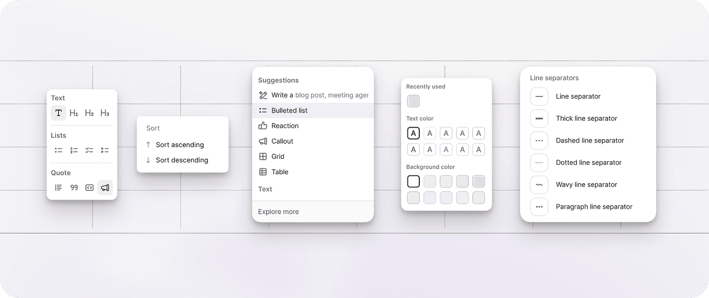
Craft’s peaks and valleys
In contrast, other productivity and writing apps treat menus with more equal levels of polish
When I first used Craft, I was equally impressed with both the polished UI and the team’s choice to use system defaults where differentiation wasn’t needed. They focused on what mattered and kept the rest simple.
Design systems can flatten a product’s landscape if we’re not careful.
When design systems are applied without regard for a product’s unique conceptual foundation, they don’t just make things look similar; they also undermine the product’s distinct identity. This shows up across all three tiers:
Data fidelity collapses when diverse data models are forced into identical visual patterns, obscuring the essential differences between what users need to recognize and choose.
Aesthetic integrity fractures when form becomes divorced from function, as generic components override task-specific interactions.
Selective excellence disappears when uniform polish replaces strategic peaks of investment, eliminating the moments that should define a product’s identity.
Sameness isn’t a creativity problem. It’s an architectural one. To fix it, we need to restore intention in our design systems.
From dilution to differentiation: The Accelerators, Differentiators, Diluters framework
A design system isn’t just a library of parts or a visual theme. At its core, it’s an architectural map for your product. This map shapes both development speed and product vision. To keep your system a strategic asset, not a source of sameness, you need to assess its components as Accelerators, Differentiators, or Diluters.
Accelerators are unopinionated, focused building blocks. Their job is to create efficiency by handling all the underlying functionality that developers shouldn’t have to build from scratch every time. These components:
serve as low-level primitives with a minimal, single responsibility (e.g.,
Section, Popover, Table.Body, Table.Cell)have a minimal prop count focused solely on essential presentation and accessibility concerns
make zero assumptions about layout or content structure, requiring explicit composition from the consumer
are easily extensible using standard composition patterns like the children prop or slot mechanisms
separate presentational concerns completely from business logic, domain-specific data, or state management
have an API surface that remains stable over time, rarely needing additions because the scope is narrow and well-defined
Differentiators are opinionated, focused solutions. These components make your product unmistakably yours. They’re strategically chosen and well-crafted because they serve your specific domain, strategy, or values. These components:
combine multiple Accelerator components into a specific, opinionated layout or workflow pattern (e.g.,
ProductList, OrderList, InventoryTable)have a mid-level prop count that focuses on configuring domain-specific content or behavioral variations
make strong, deliberate assumptions about content and user workflows to enforce a specific product strategy or brand value
are designed to be customized within specific, defined boundaries but not easily genericized for other domains
encapsulate product-specific logic or data fetching to create a cohesive, unique user experience
have an API surface that evolves with product strategy, reflecting changes in core business requirements or user tasks
Design systems should ideally only have Accelerators and Differentiators. But over time, these focused components can transform into diluters.
Diluters are opinionated but unfocused. These are components that started with a clear intent but have been generalized and bloated to serve too many use cases. Diluters erode both efficiency and differentiation. These components:
bundle multiple UI patterns or behaviors into a single interface
have extensive configuration props that attempt to cover all possible use cases
make strong assumptions about layout, content structure, or user workflows without specific domain-context
are difficult to extend or customize without modifying the core implementation
combine presentational and behavioral concerns in ways that limit reusability
have an API surface that has grown significantly over time to accommodate edge cases
The pit of dilution
Diluters block design progress. Updating a design system should be predictable, but Diluters create unpredictable, cascading effects. A simple UI change, like adding a hover card to a Table or moving an icon in a Combobox, becomes a technical challenge. Tight coupling creates hidden constraints: CSS overflow clips overlays, stacking contexts hide tooltips, and prop combinations cause layout shifts. What looks like a quick polish to leadership can turn into a month-long project as your team untangles dependencies. This is the core tension: leaders see slow progress, while design system teams are stuck with years of technical debt.
Accelerators can turn into Diluters if they become too complex. For example, a TextField that tries to handle everything, email validation, currency formatting, password strength, quickly grows out of control.
However, the worst Diluters limit Differentiators by imposing composition constraints without enough domain context. A design system full of diluters can’t support a differentiated product experience. That’s why Diluters are a major source of sameness.
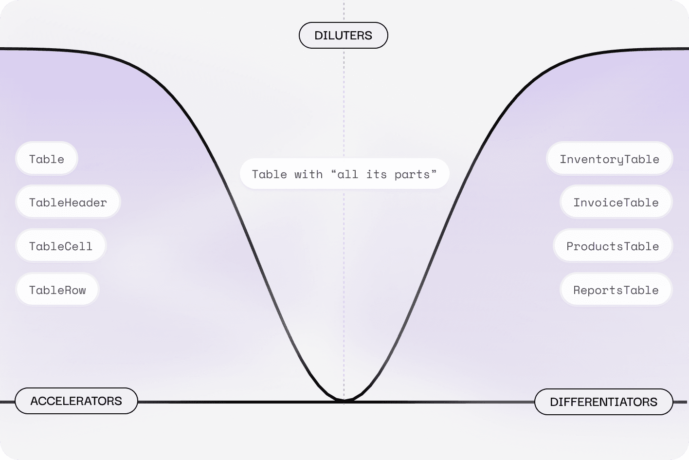
This taxonomy creates a strategic framework: standardize for efficiency, specialize for competitive advantage, or rebuild what’s eroding both.
Transforming diluters: From monoliths to composable accelerators
At Shopify, one of our “diluter” components was the Combobox. The Combobox component powers multiple pickers: tags, collections, and customers, to name a few. However, its prescribed architecture created design constraints. Despite fundamentally different data models (Collections with rich metadata like title, handle, rules, and images; tags as simple text labels), the pickers appeared identical.
The Combobox mandated a specific composition: TextField activator → Popover → Listbox. This architectural requirement prevented visual distinction between components with divergent underlying data structures. Yet the component delivered significant value: developers could rapidly ship accessible, well-behaved controls with autocomplete. Building custom solutions purely for visual variation wouldn’t justify sacrificing these efficiency and accessibility benefits.
Because the Combobox required a specific composition, visual range was limited
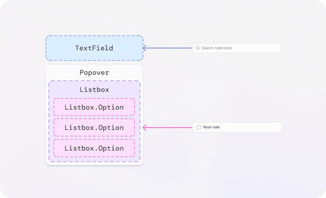
A better approach would have been to rebuild the component as a pure Accelerator that handles only accessibility and interaction. This model separates the core logic, such as keyboard navigation, focus management, ARIA semantics, and search filtering, from the visual rendering of menu items. You can see this pattern in libraries like the Shadcn Combobox, which uses flexible primitives like Command to provide interaction logic without dictating visual design.
The Shadcn Combobox is built by combining three main primitives:
Popover:Manages the open/closed state of the dropdownPopoverTrigger:The actual activator elementCommand(The list/search logic): Contains the CommandInput (the search field) and the selectable items
The PopoverTrigger accepts an asChild prop, which allows you to pass any React element as the trigger. For example, in the basic Shadcn implementation, the trigger is typically a Button that visually appears like an input field with a dropdown icon. However, you are completely free to swap this out for:
A
TextField(so users can immediately start typing into the element)A stylized
Badge(for a “Set Status” picker)A non-textual
Icon(if space is limited)
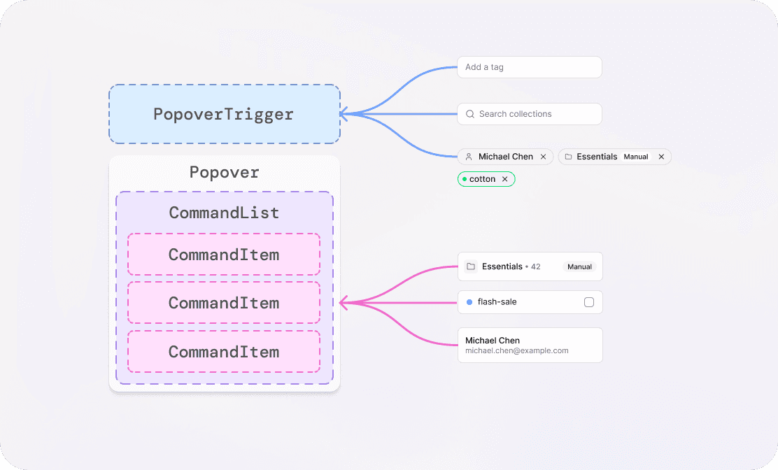
A composable Combobox component enables more visual distinction
Intent-based naming for new primitives is also critical. Instead of naming a component based on its visual appearance, like TextField, name it after its role in the composition, such as PopoverTrigger. This makes the API self-documenting and clarifies the component’s purpose. Semantic clarity improves developer onboarding and maintainability, and helps AI-assisted development tools suggest relevant components.
This composition-based approach lets you build true Differentiators, like specialized pickers. The CustomerPicker and CollectionPicker are not heavy forks of the base Combobox. They are high-level wrappers that take domain-specific data and map it into the base component’s item slots. They supply custom render logic for the item slots to show complex, data-specific structures, such as a Customer’s avatar, multiple lines of text, and statistical pills, or a Collection’s hero image, handle, and rule badges.
This separation of concerns keeps the core component clean and efficient. The Accelerator handles the underlying mechanics, like keyboard interaction and list management. The Differentiator controls the data-rich visual design. This prevents dilution and helps create unique product experiences.
Removing diluters from your system
Identifying a Diluter is just the first step. The real work is to create a plan to refactor it into something useful or remove it. Diluters are deferred costs that need to be addressed directly.
1. Identifying and Quantifying the Problem
Diluters often hide in plain sight. They are components that everyone uses but no one likes. To pull them out of the shadows, you need both quantitative data and qualitative feedback.
Quantitative (Objective)
Use code analysis tools to measure:
Prop Count: a high, growing number indicates feature creep
Override Count: how often developers use !important or deep CSS selectors to undo the component’s default styling)
Usage Frequency: a critical metric for prioritization
Qualitative (Anecdotal)
Gather direct feedback from engineers and designers: “It’s way harder to update this than it should be,” “We spend 3 hours customizing the layout every time we use it,” or “It’s impossible to change the arrow icon without rewriting the whole thing.”
A component officially qualifies as a Diluter when it meets three or more criteria from the Diluter list and shows a high prop count or consistent reports of implementation difficulty.
2. Prioritization: Fixing the Highest-Impact Debt
You can’t fix every Diluter at once. Start by asking: Which component is costing us the most time right now?
Usage Count x Technical Debt: Prioritize Diluters with the highest usage across the product, especially those with lots of bug fixes or overrides. Fixing these gives you the biggest return in engineering time saved.
Strategic Blockers: Find Diluters that are blocking new Differentiator components. For example, if your old
Dropdownis stopping you from building a newOrderSearchFilter, fix the Dropdown first.Low-Hanging Fruit: Tackle minor Diluters with simple, well-defined fixes, like separating presentation from logic. This gives you quick wins and builds momentum.
Fixing Diluters takes both strategy and steady execution. Frame the work as strategic acceleration, not just maintenance. Show the velocity tax teams pay each time they use a Diluter, and connect its removal to faster delivery of new features. Instead of rebuilding your whole component library, pick a few key Accelerators to refactor. Partner with feature teams to rebuild their Differentiators using these new building blocks. This approach validates your direction, builds buy-in, and delivers user value while you fix the foundation.
Refactoring or removing Diluters restores your design system’s core purpose: accelerate the baseline so teams can invest in distinction. Next week, I’ll explore how to shift team practice away from component-first thinking and toward designing from user intent, so your Accelerators become the foundation for purpose-built solutions.

